Payman AI
,
,
,
,
,
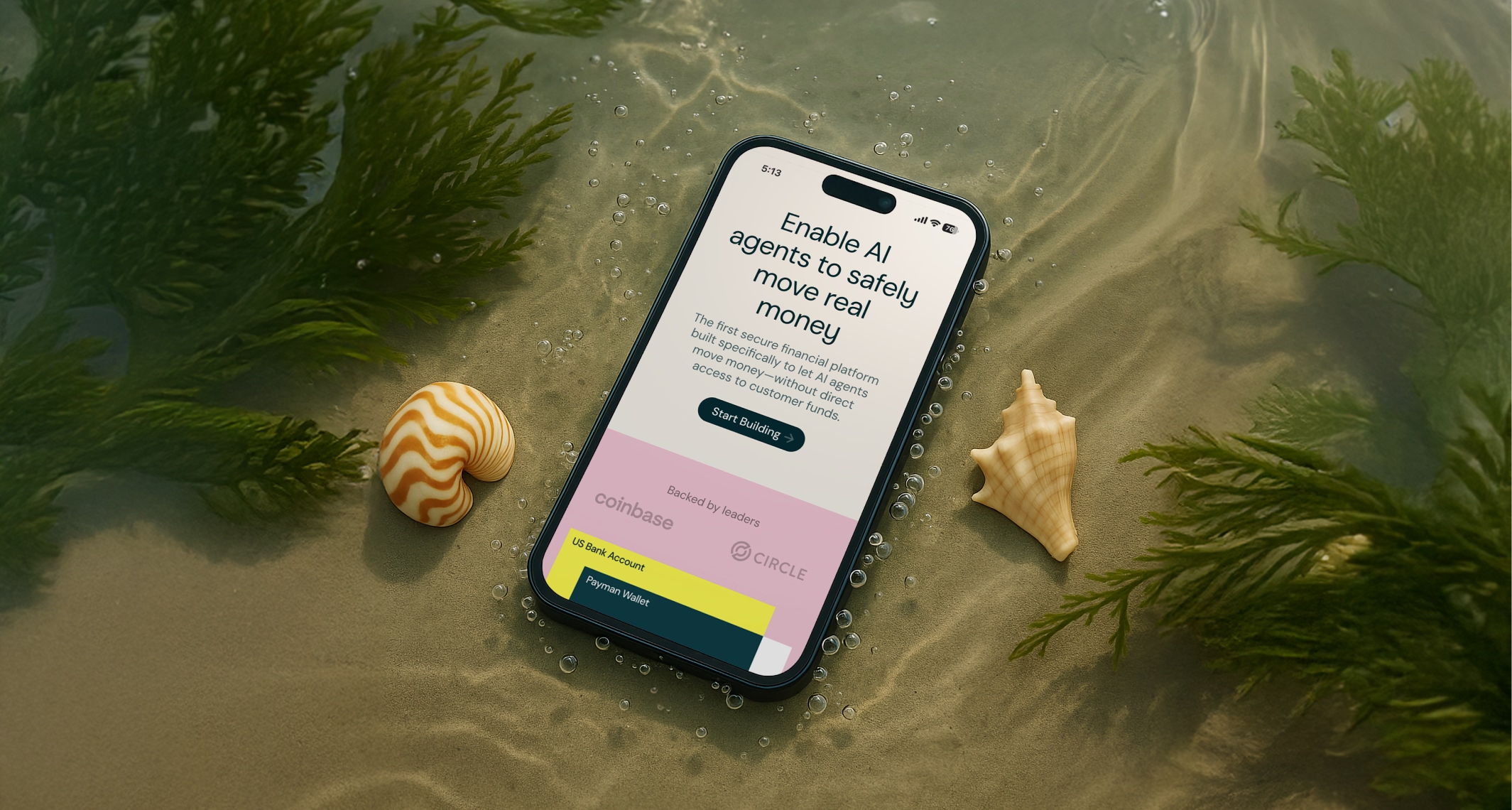
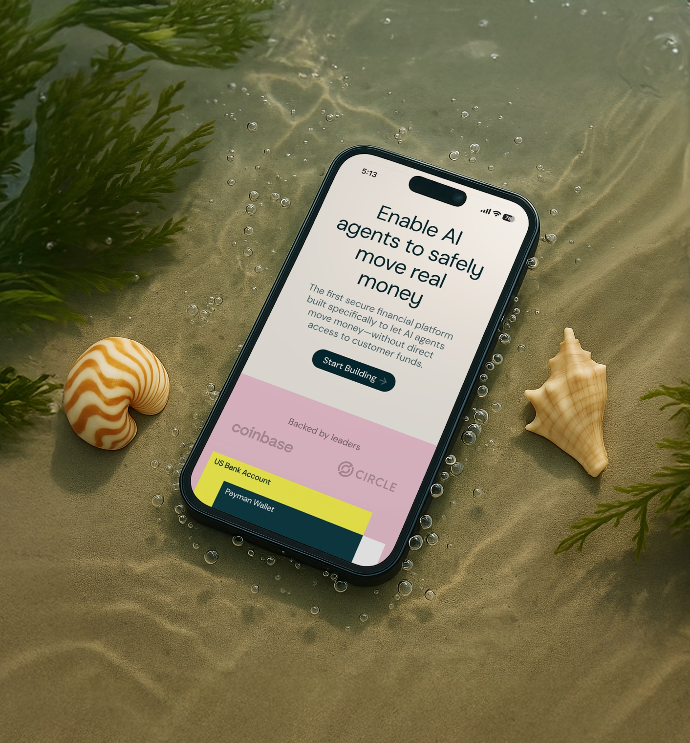
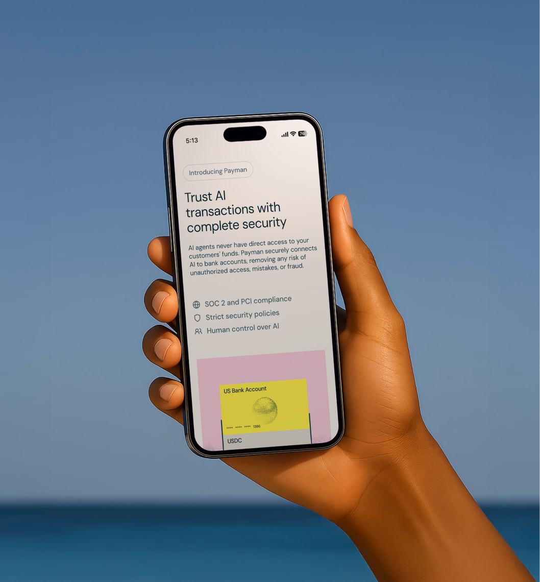
AI agents are taking over the boring, repetitive stuff we humans do. Like, sending money, booking flights, paying bills. Payman is building secure infra that lets agents move real money without touching customer funds. And by real money, we mean green and crispy, straight from the US banks.
After raising $13.8M from backers like Visa and Coinbase Ventures, Payman AI came to O0 for a new brand, website, and pitch deck. The goal was to make the most of their HF0 residency and gear up for Series B.
Got 2 awards:
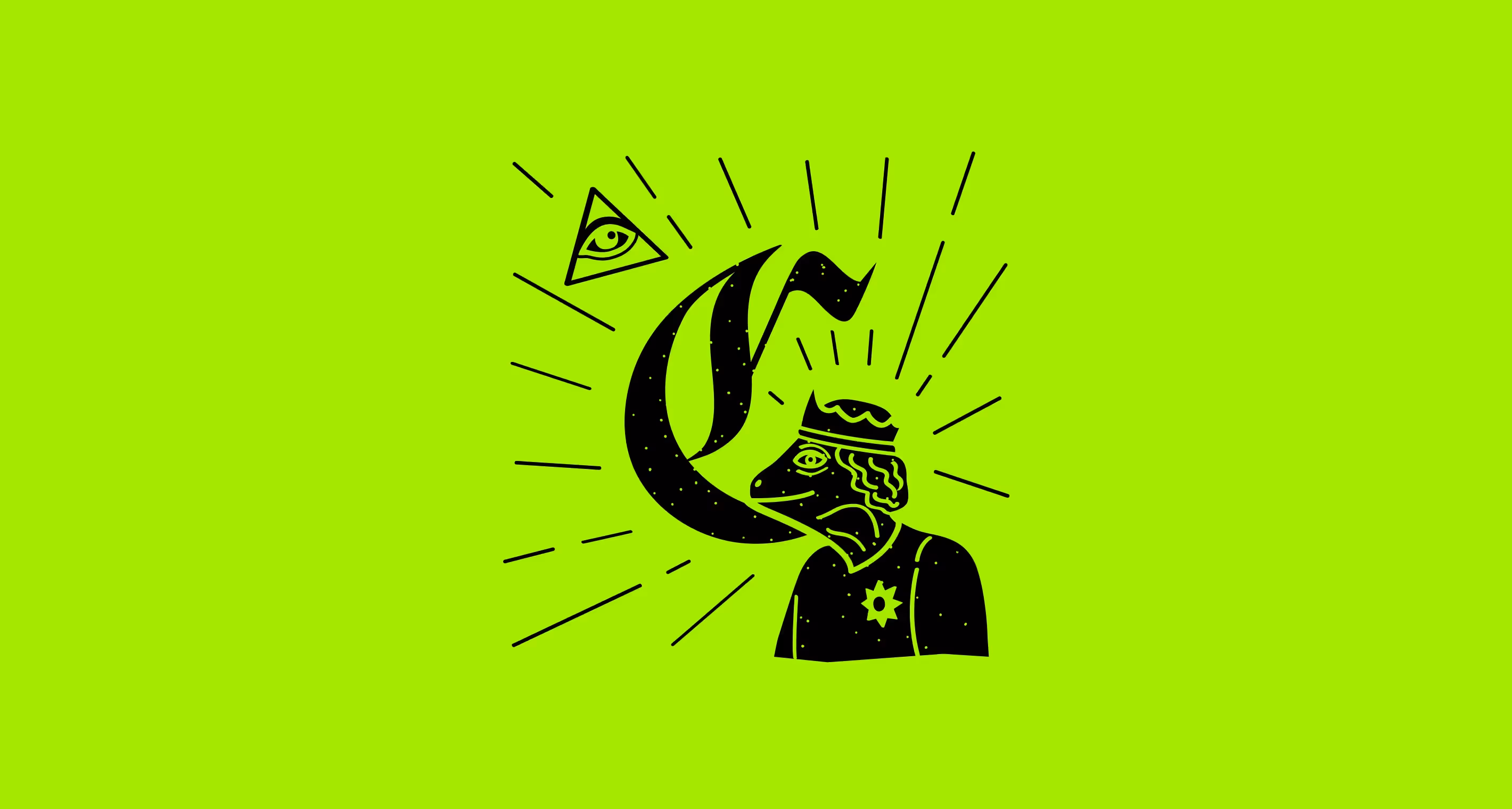
In the beginning, it was a shell. Our ancestors used them as currency. And at the start of the rebrand, there was a shell too. It just didn’t feel like a gem, so we refined it.
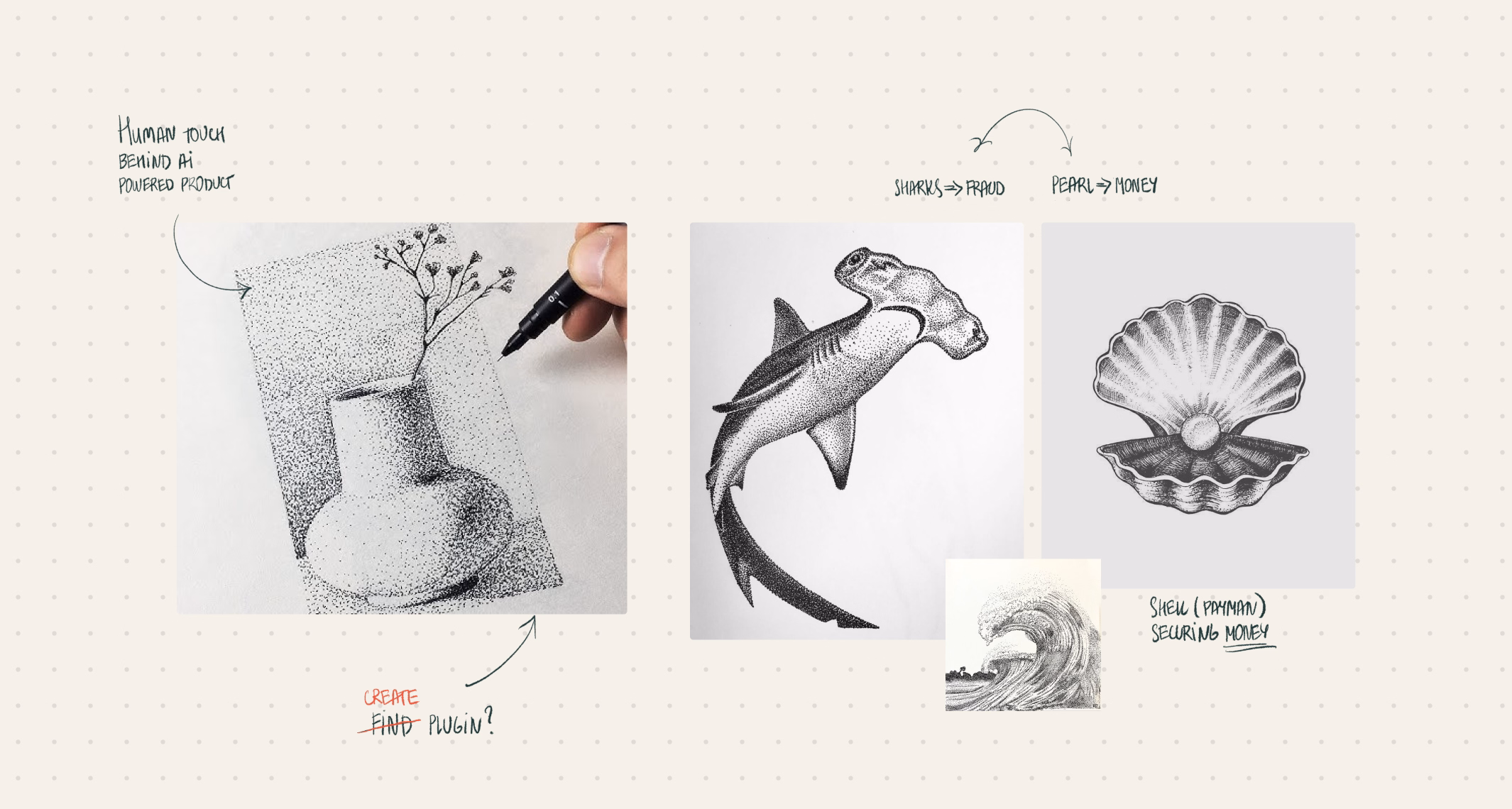
O0’s team shaped the logo into an infinity shell. It symbolizes how Payman handles every money task on repeat, without a hitch. From there, everything flowed. Pearls stand for money, sharks chase fraud, and the shell keeps your funds safe and sound.
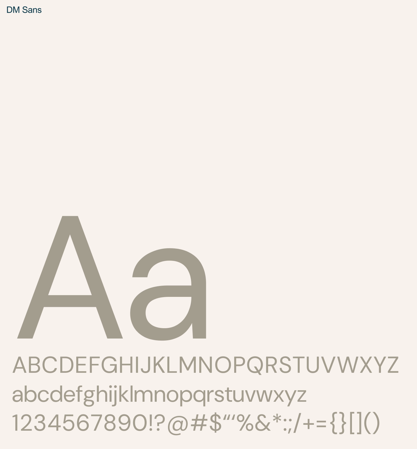
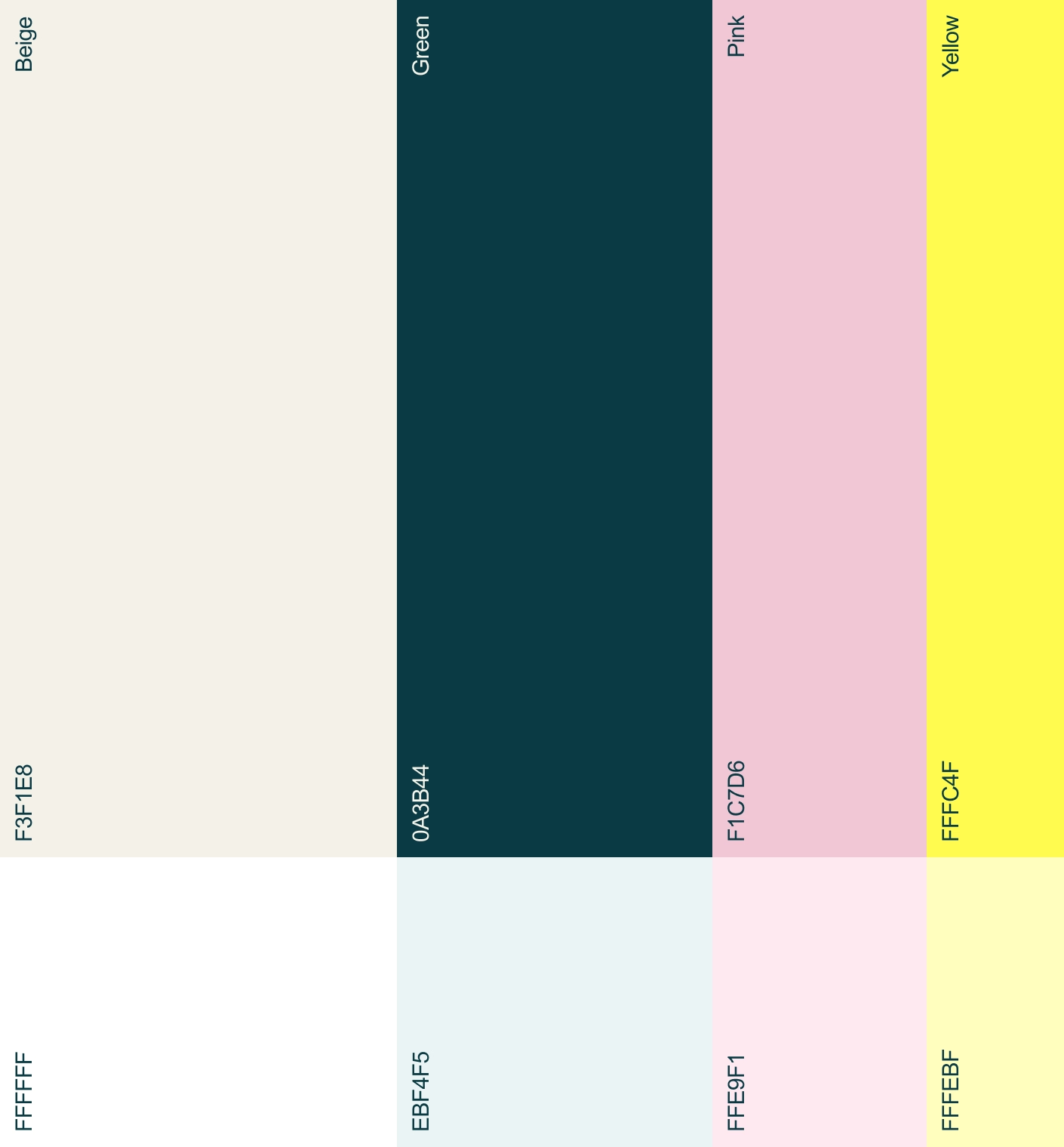
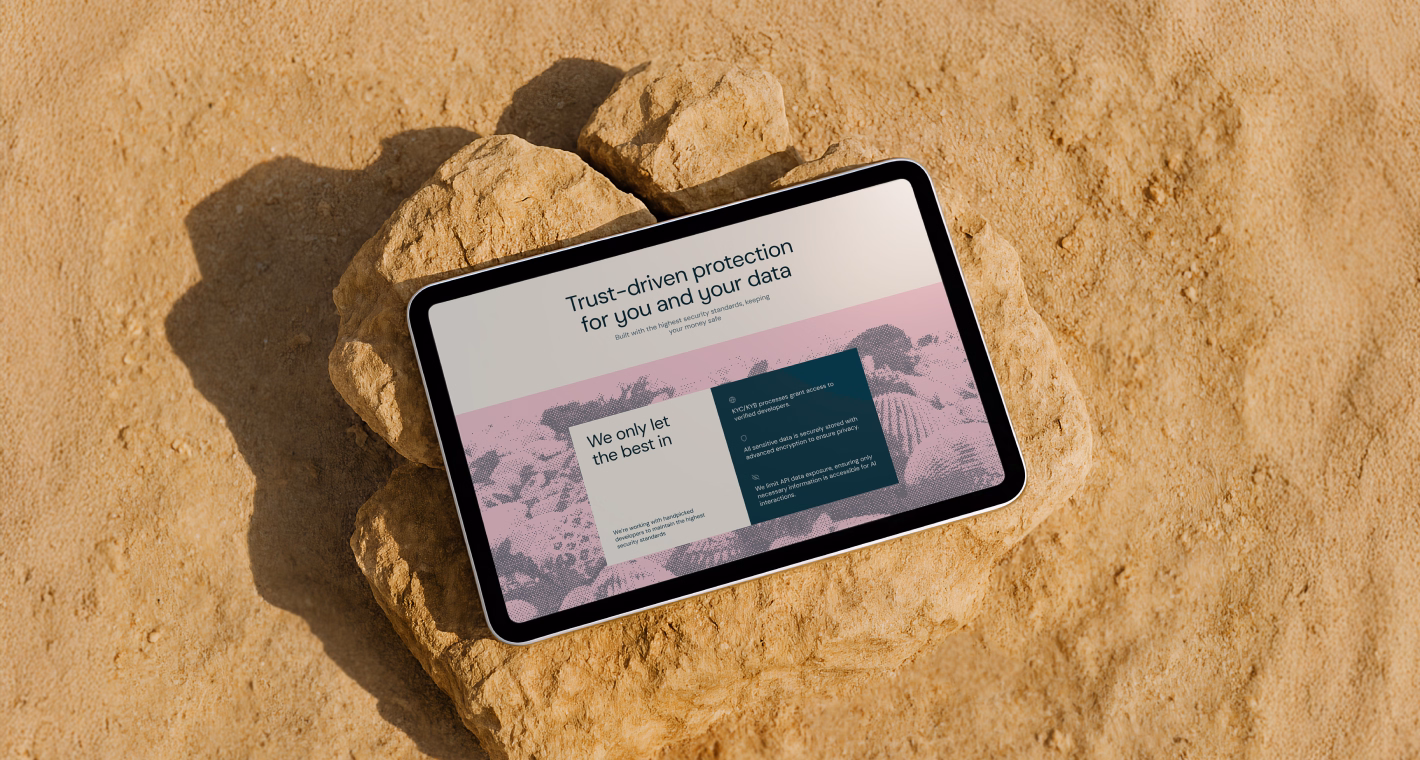
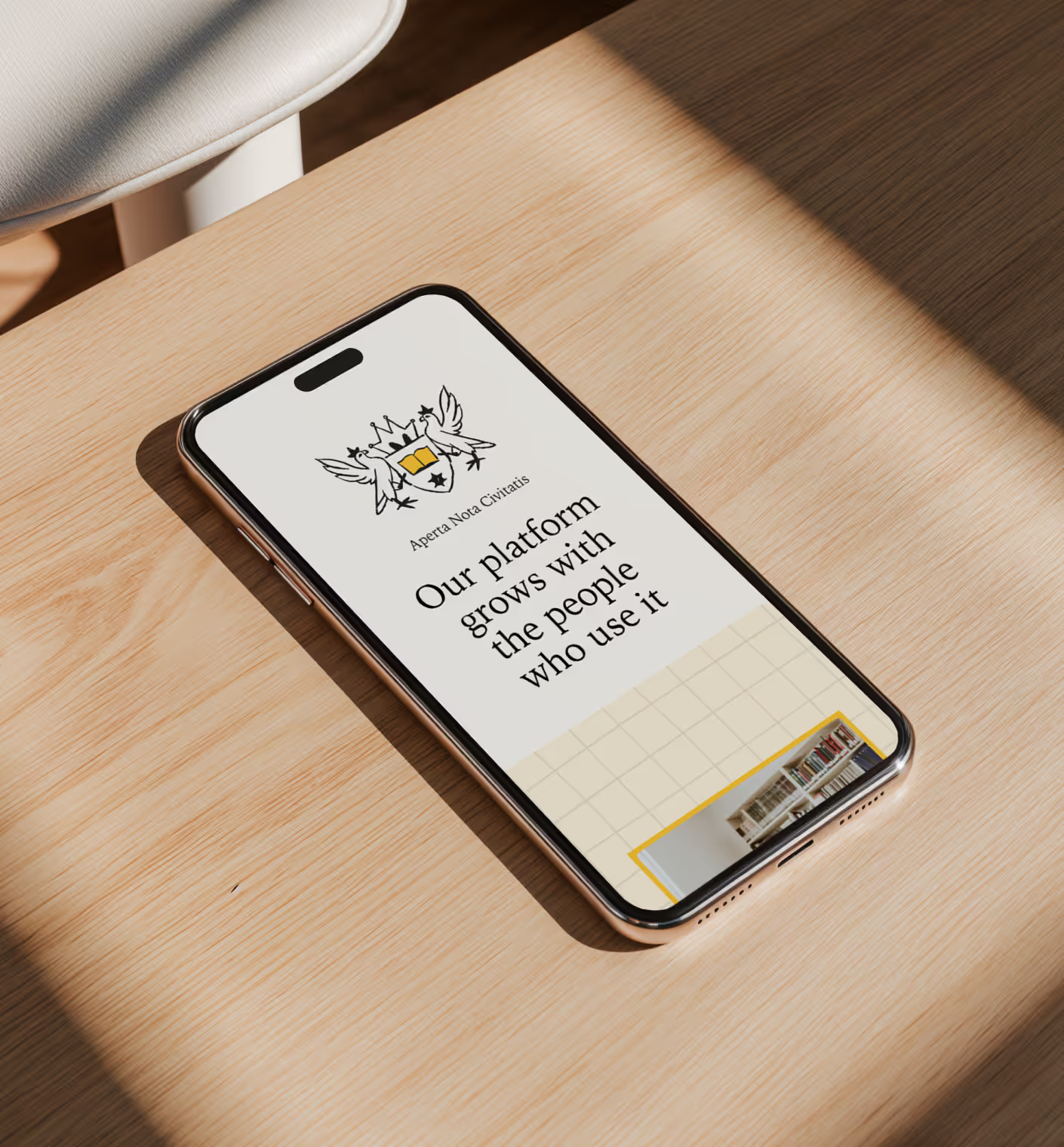
The color system carries meaning too. Green, beige, and soft pink are signature Payman tones, while bright green signals real money tied to actual bank accounts.

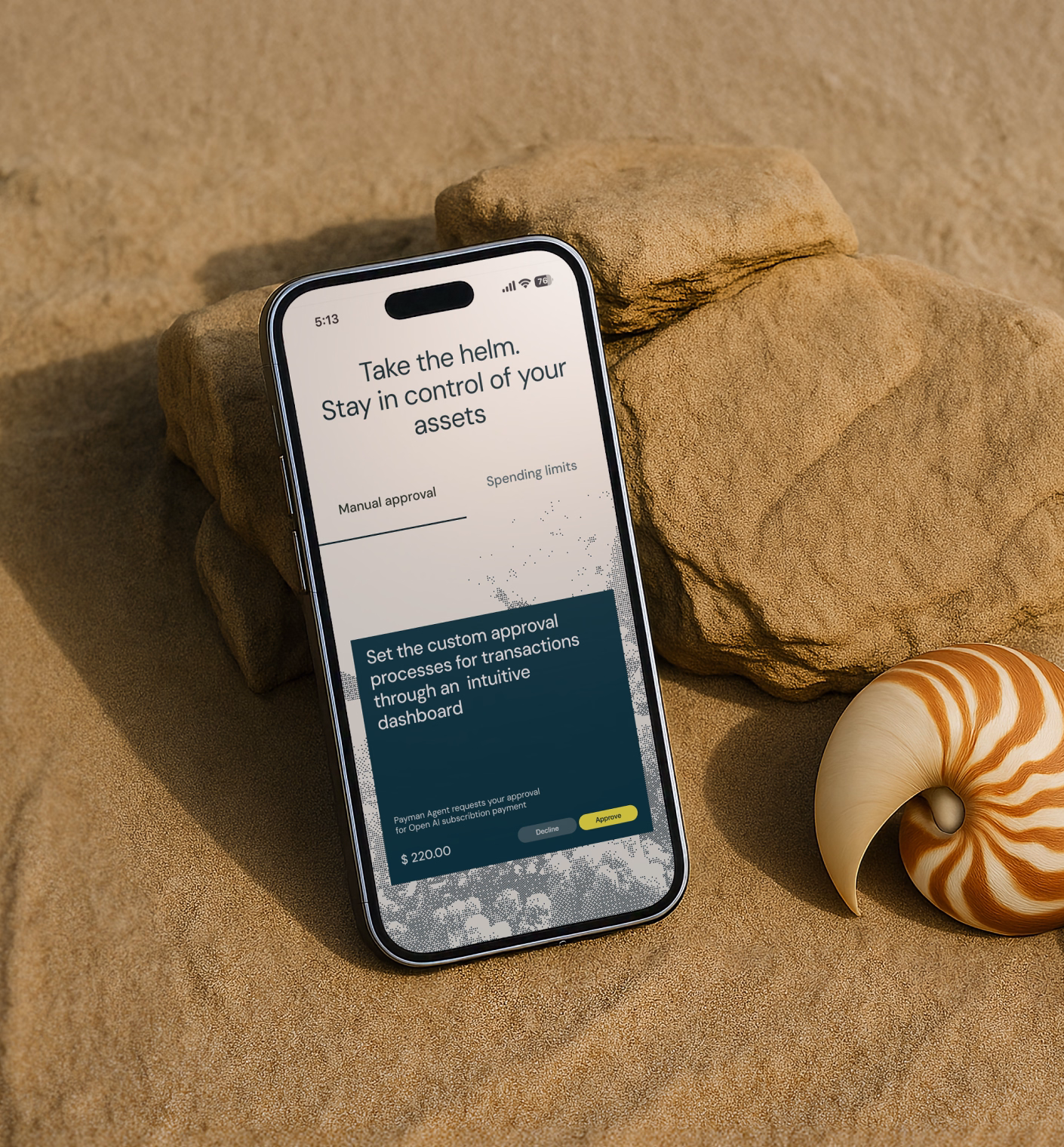
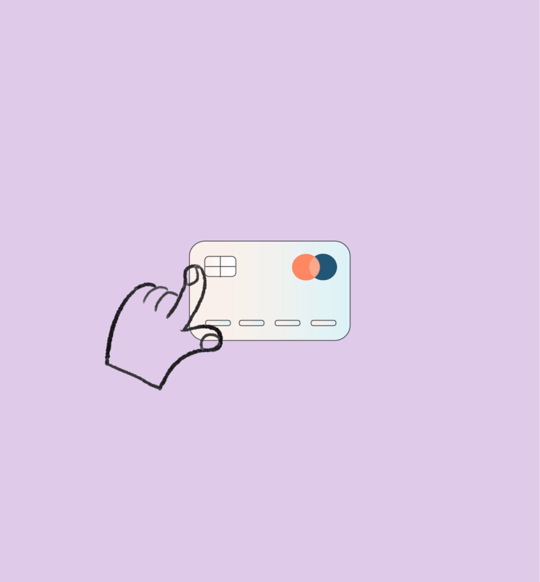
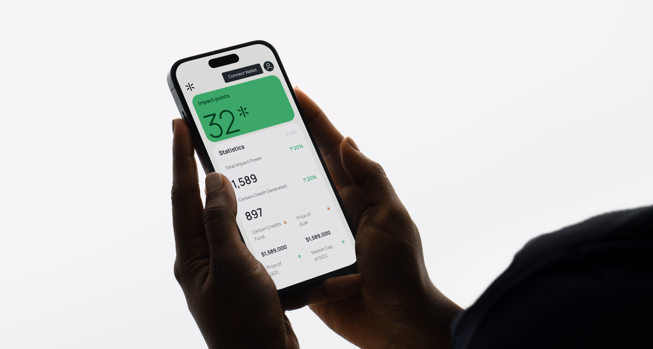
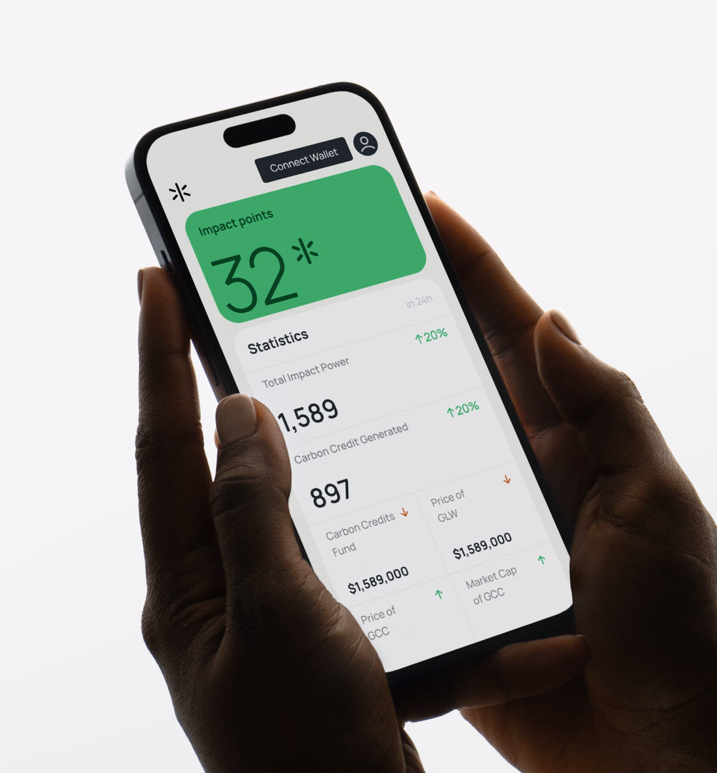
Payman AI serves as a financial bridge between artificial and human intelligence. To reflect this duality in the UI, we integrated a human touch with AI-spiration.
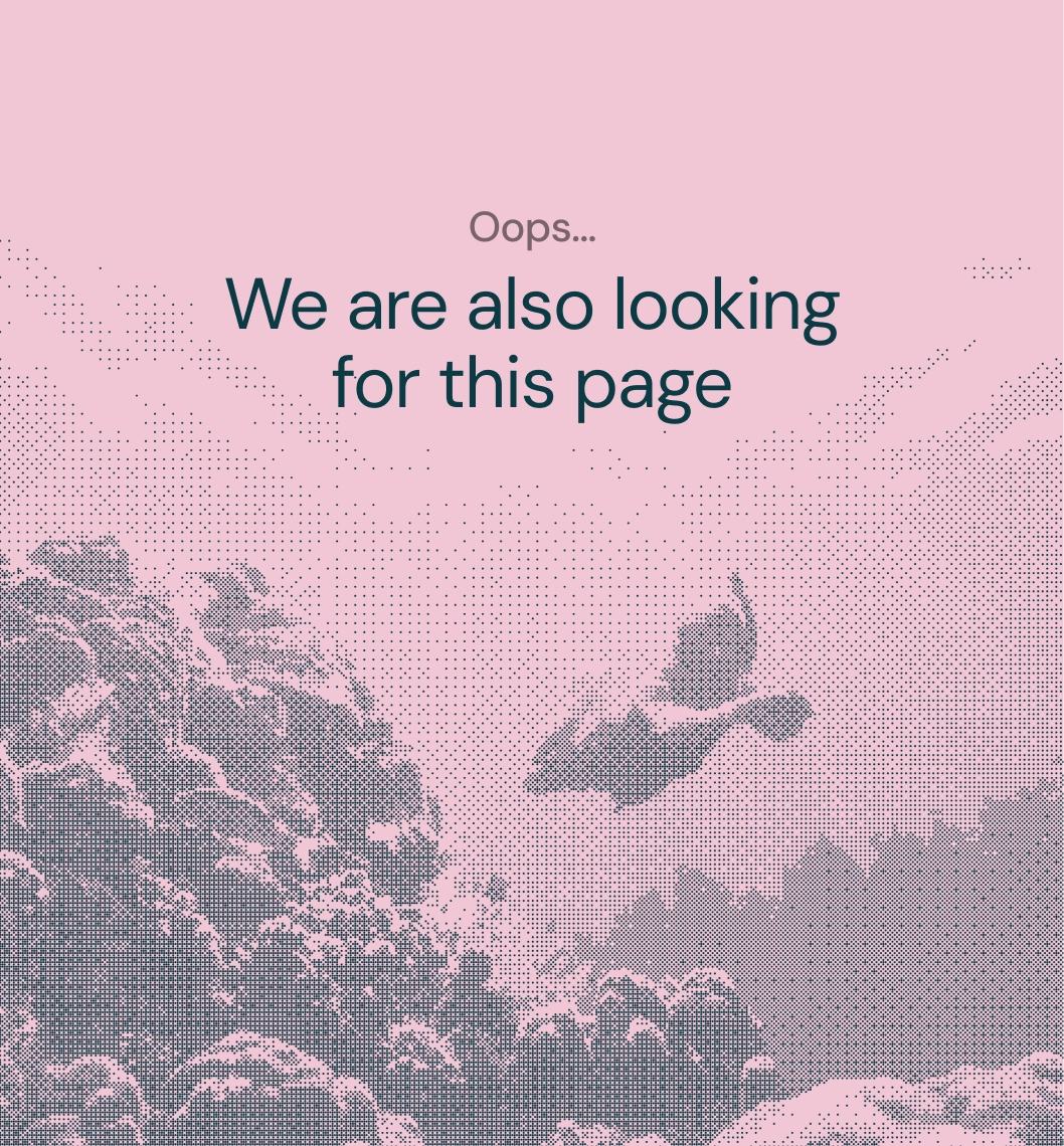
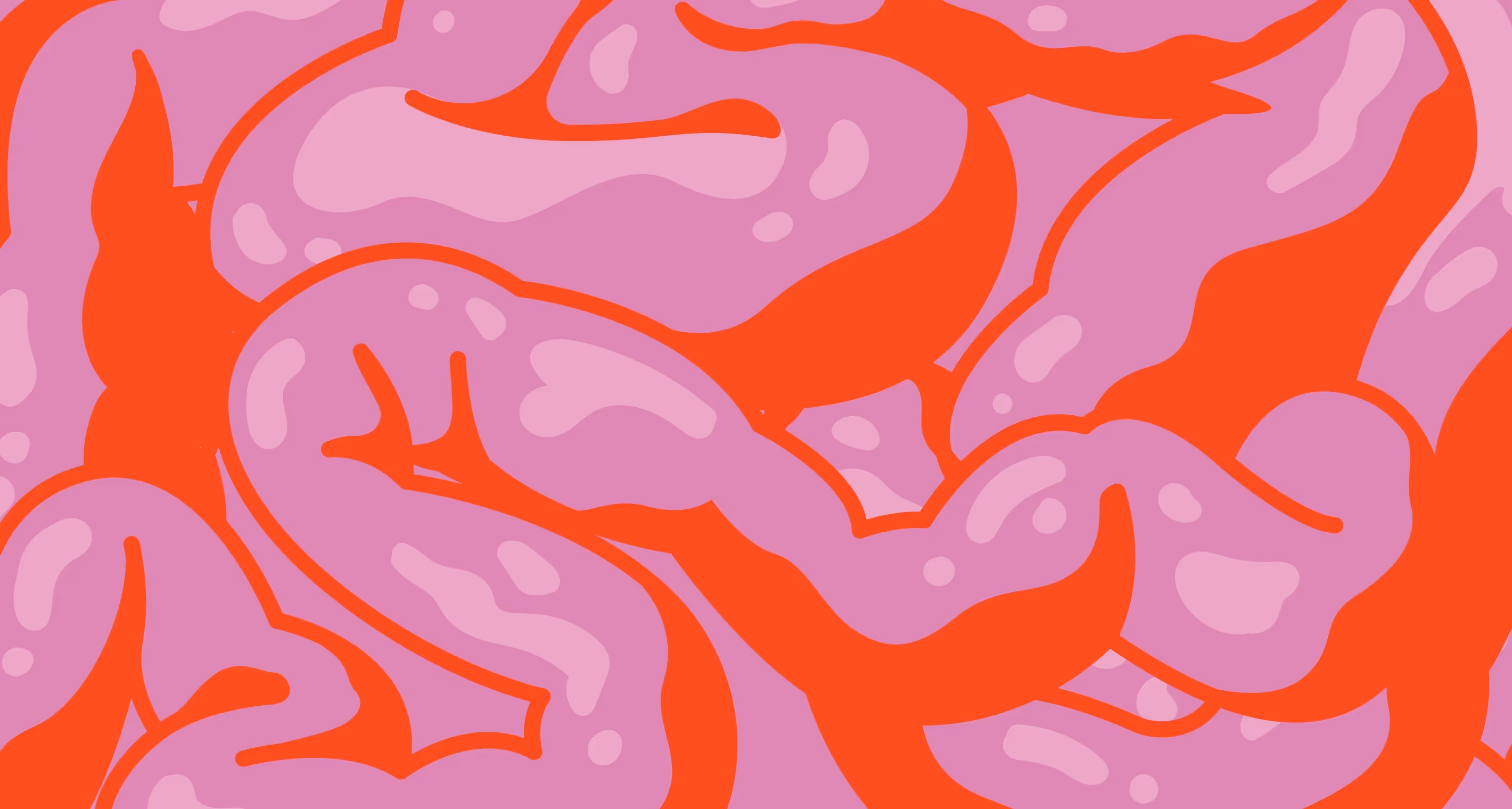
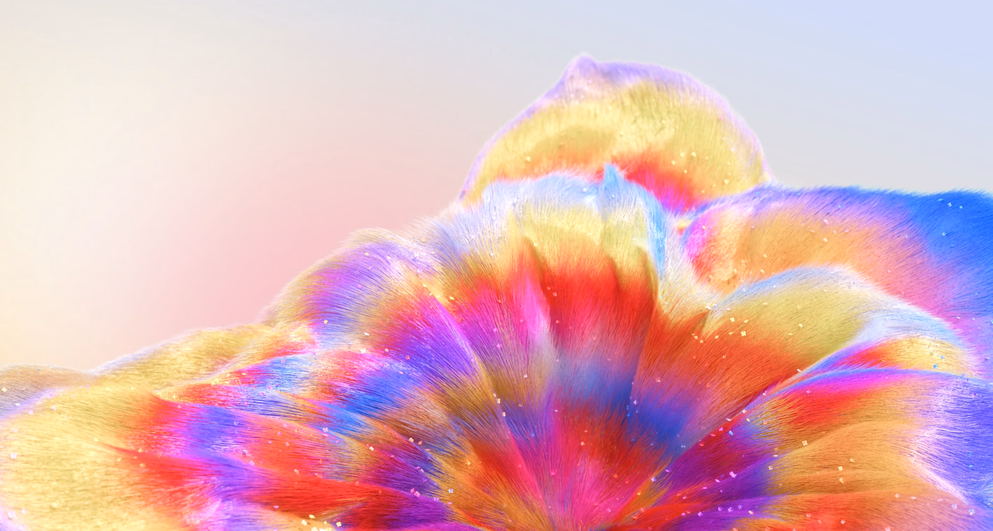
Leveraging ChatGPT, our designers created custom code to generate Dithering art. It’s a digital take on the classic stippling technique, but with pixels replacing the dots. You got it right — we used AI to craft content for an AI-driven product because, well, we’re an AI-native studio.
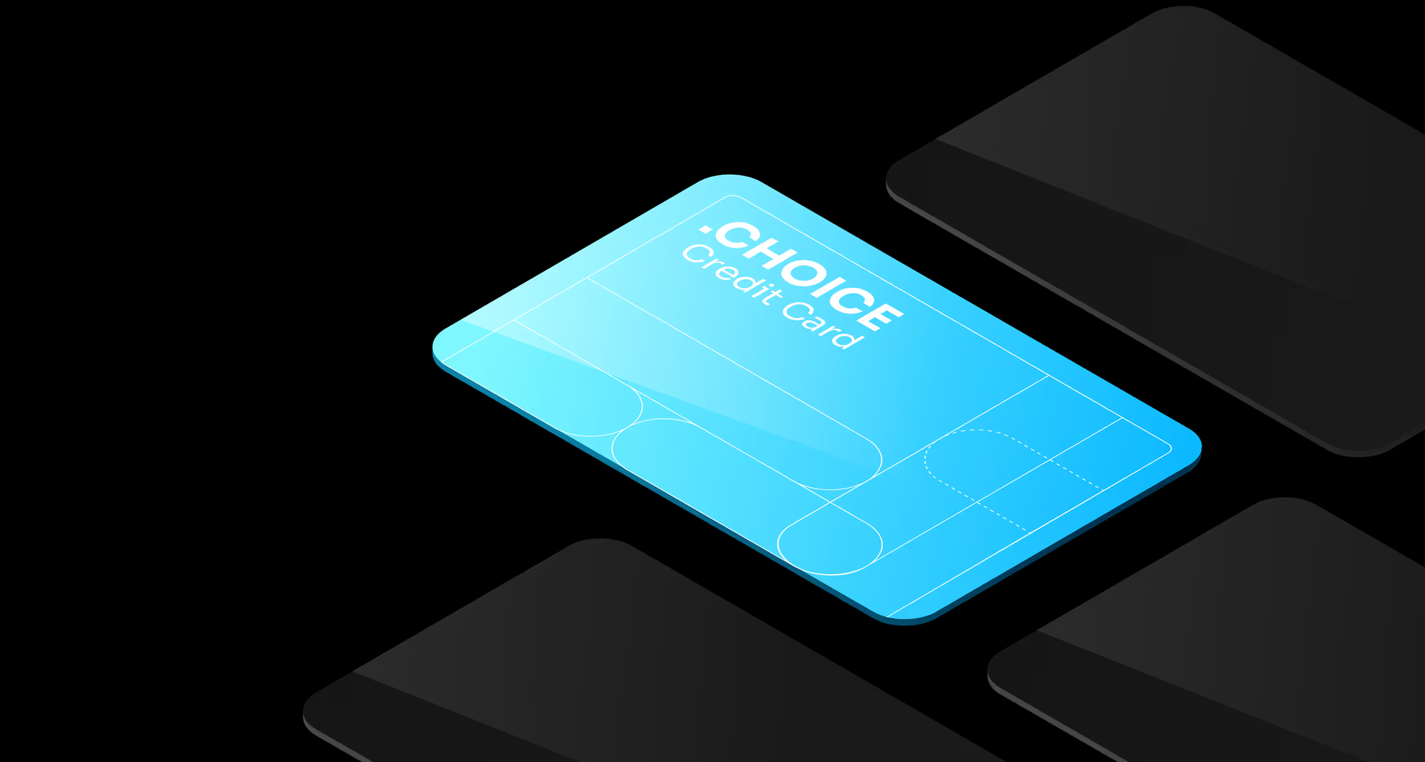
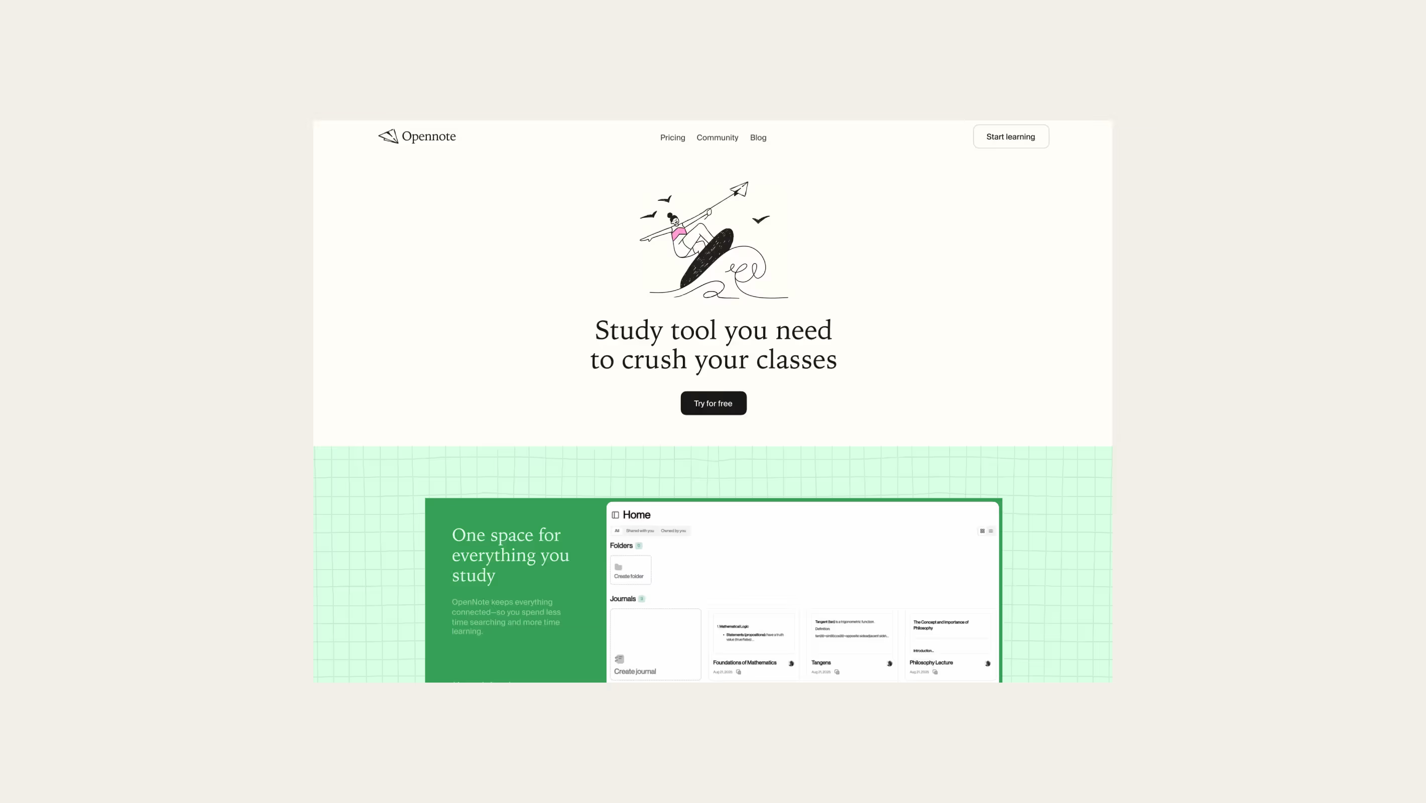
Although Payman already had a web app, we didn’t directly reuse its UI. Instead, we reimagined it in our own visual language — preserving the core meaning while elevating the experience.
Subtle micro-interactions and micro-animations add a sense of motion and intent without overwhelming users.

“You all have been an absolute pleasure to work with. I will always look forward to working with you again in the future!”


.avif)


.avif)
.avif)


.avif)


